
When Branding Needs to Look Like Authority!
In the government tender ecosystem, design is not decoration, it is credibility.
Both NEITCO and JKITCO required more than basic branding. They needed a complete, structured identity system that could match the expectations of government bodies, decision-makers, and institutional stakeholders.
The real challenge was not starting a brand
It was making it look established, reliable, and powerful from day one
Our Approach: Building the Brand Like an Institution
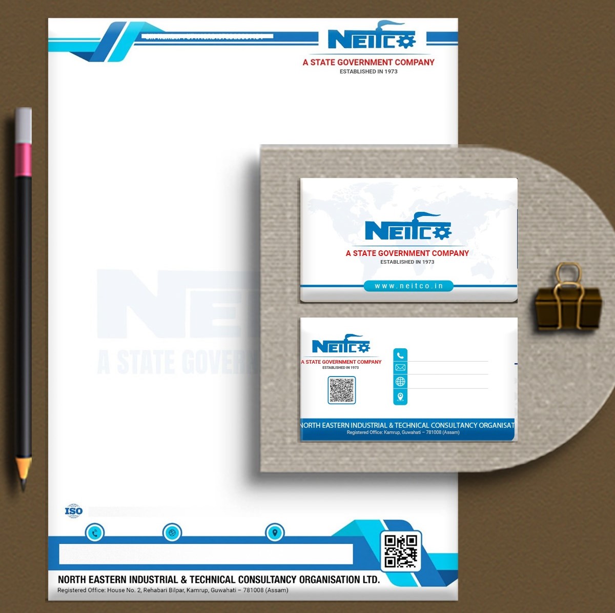
Visiting Card
Our approach to the visiting card design focused on transforming a simple contact medium into a powerful brand statement that reflects credibility, clarity, and institutional strength.
We ensured that every element, from typography to spacing and colour balance, aligns with a professional identity that leaves a lasting impression at first glance.
By minimising clutter and structuring information with precision, the card communicates authority and trust while maintaining a clean and modern aesthetic that resonates with stakeholders across industries.
- Clean and minimal layout for instant readability
- Strong typography reflecting authority
- Balanced colour palette for brand recall
- Structured information hierarchy
- Premium, modern visual appeal
Letterhead
For the letterhead, our objective was to reinforce professionalism in every official communication while maintaining strong brand recall.
The design balances subtle branding with functional clarity, ensuring that the document remains formal yet visually distinctive.
By integrating brand elements in a restrained and elegant manner, we created a letterhead that enhances the organisation’s credibility in all correspondence, making every document feel authoritative, consistent, and aligned with an institutional identity.
- Subtle branding with a professional tone
- Clean layout ensuring document clarity
- Consistent alignment with brand identity
- Minimal yet distinctive design elements
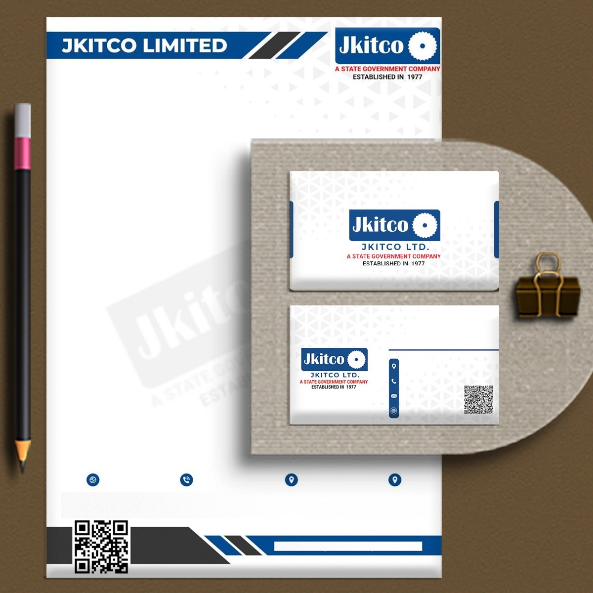

Company Profile
While developing the company profile, we approached it as a narrative of legacy, capability, and vision rather than just an informational document.
The structure was carefully crafted to present the organisation as an established institution, highlighting its history, achievements, and expertise in a cohesive and engaging manner.
Through consistent visual language, refined layouts, and thoughtfully organised content, we created a profile that not only informs but also builds confidence among clients, partners, and investors, positioning the brand as dependable and forward-thinking.
- Story-driven structure showcasing legacy and growth
- Consistent visual identity across all sections
- Clear presentation of services and expertise
- Engaging layouts for better readability
The Transformation: When Branding Starts Working for You
As the ecosystem came together, the shift was clearly visible. What started as a basic presence evolved into a complete, professional-grade brand system.
The biggest change was not just in how the companies looked, but in how they were perceived. Their communication began to carry clarity and structure. Their documents started reflecting seriousness and preparedness. Their website began acting as a silent pitch, answering questions, building trust, and reinforcing their capabilities without the need for constant explanation.
In meetings, presentations, and submissions, the brand started doing what it is supposed to do: support the business, not hold it back.
The Impact
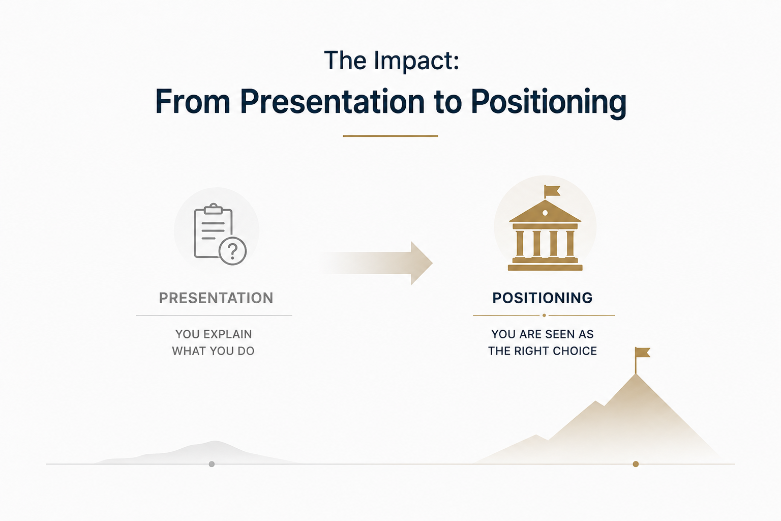
Our work enabled NEITCO and JKITCO to step into conversations with a completely different level of confidence. They were no longer just explaining what they do; they were presenting themselves as organisations that are already equipped to handle responsibility.
This shift helped in creating stronger first impressions, which is crucial in spaces where decisions are often influenced within moments. Their materials now align with the expectations of government bodies and institutional stakeholders, allowing them to position themselves as serious and capable players in the consultancy domain.
More importantly, the foundation we built is scalable. As they grow, expand, and take on larger projects, their brand system is already designed to support that journey.
What This Means for Similar Businesses?
For companies operating in consultancy, infrastructure, or tender-based industries, this case study highlights a simple but powerful truth, your capability alone is not enough if your presentation does not reflect it.
In high-trust sectors, people don’t just evaluate what you say; they evaluate how you present it. A structured brand identity, professionally designed documents, and a credible digital presence can significantly influence how your business is perceived, and ultimately, the kind of opportunities you attract.
Final Word: Where Strong Brands Become Strong Businesses?
If you are operating in sectors like government consultancy, infrastructure, tenders, or institutional services, your brand cannot look average.
It needs to reflect authority, structure, and trust from the first interaction itself
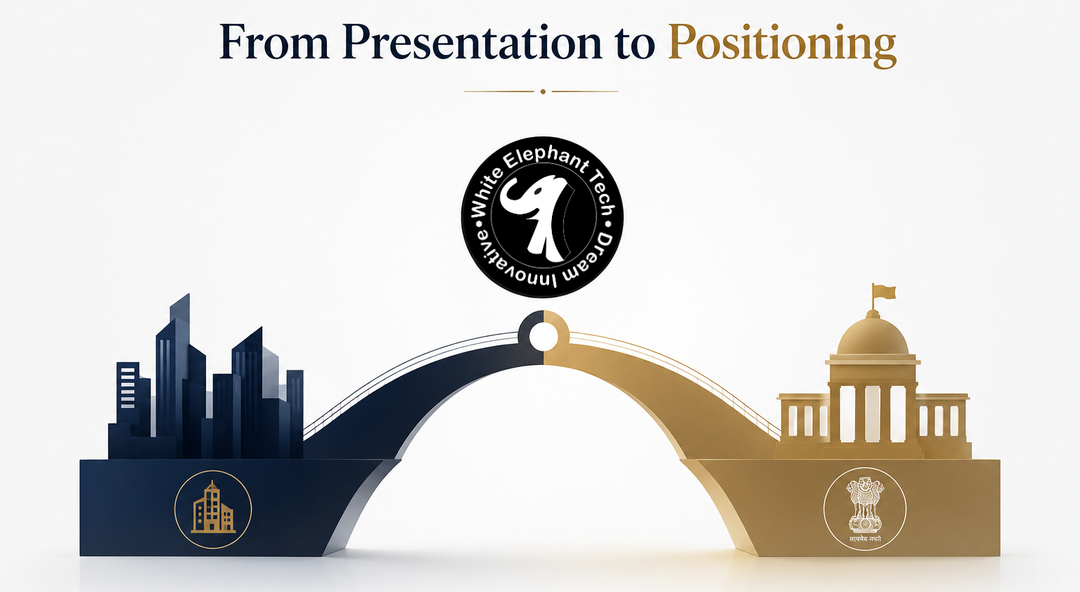
At White Elephant Tech, we don’t just design assets, we build business-ready brand ecosystems. Our work for NEITCO and JKITCO reflects how the right strategy, when executed with precision, can transform perception into positioning. If you are building or scaling a consultancy firm, especially in the government or institutional space, this is exactly where your journey should begin, with a brand that looks as strong as your vision.
Because in this space, getting noticed is good
But being taken seriously is everything
And that’s exactly what we help you achieve.