- September 23, 2025
- Posted by: Admin
- Category: Blogs
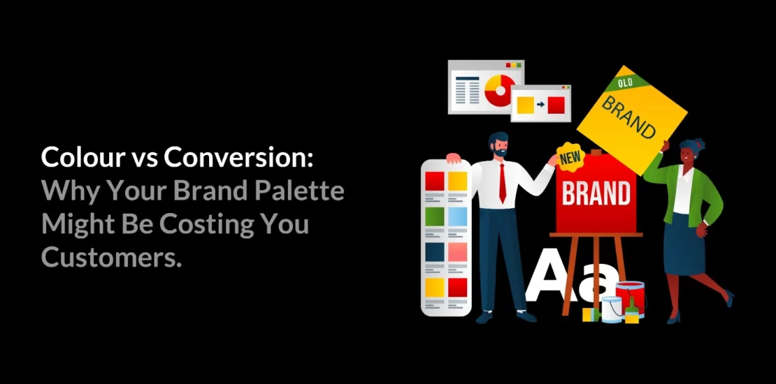
Introduction: The Subtle Power of Colour in Marketing
Colour is not just a design choice; it is a silent salesman. The colours you choose for your brand palette directly impact customer trust, buying behaviour, and ultimately conversion rates. This is where colour psychology in branding plays its role. From the bright yellow arches of McDonald’s to the calming green of Starbucks, successful companies know how to turn colours into conversion assets.
When was the last time you noticed how a brand’s colours made you feel? Whether it’s the calming blue of a banking app or the energetic red of a food chain, colours speak to us long before words do. In fact, your brand palette isn’t just about looking good; it can make or break customer decisions. This is where the science of colours becomes more than design; it becomes strategy.
Colour Psychology in Branding: Why It Matters for Conversions
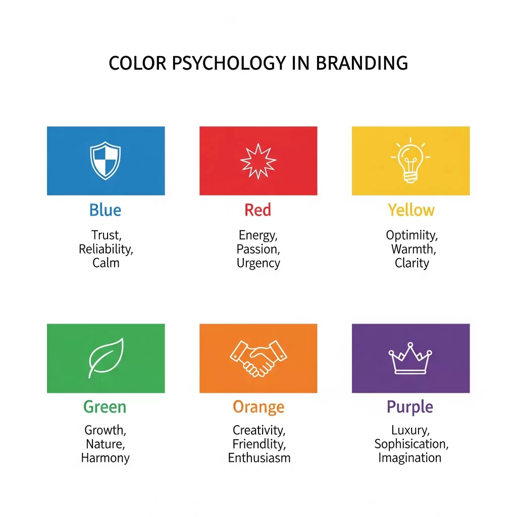
Colour psychology in branding is all about understanding how different colours influence emotions, perceptions, and buying behaviours. Customers don’t just see your colours, they subconsciously connect them with trust, urgency, excitement, or calmness. For example, green often symbolises growth and balance, making it popular among eco-friendly brands, while orange conveys enthusiasm and creativity, which works well for lifestyle or entertainment businesses.
If your colour choices align with your target audience’s psychology, conversions naturally improve. But if your palette creates confusion or sends the wrong emotional signals, it can quietly drive potential customers away without you even realising it.
The Connection Between Brand Palette and Customer Perception
The connection between brand palette and customer perception is deeply rooted in how people respond emotionally to colours. A carefully chosen palette creates consistency, builds trust, and influences how a brand is remembered. Through colour psychology in branding, companies can shape buying decisions, strengthen recognition, and establish the right emotional tone that aligns with their values and identity. It could even be one of the secret ingredients behind your campaign’s success.
Here’s how it works:
- Colours trigger emotions
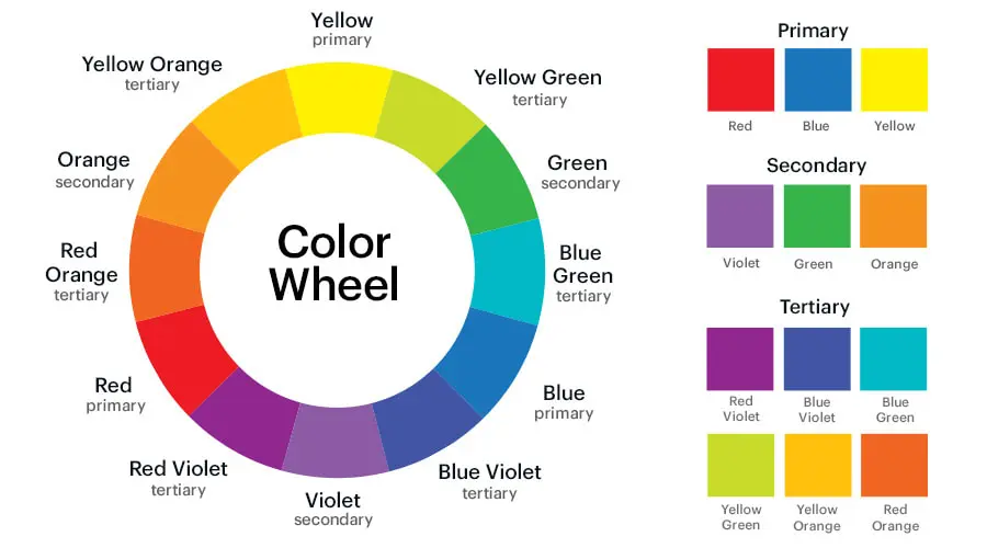
Each colour has a psychological meaning. For example:
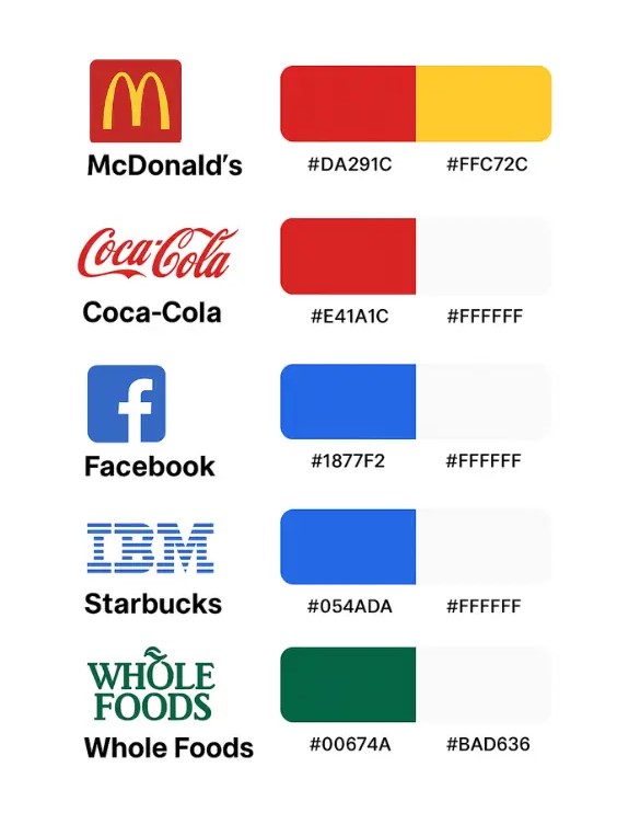
- Red (McDonald’s, Coca-Cola) creates excitement, appetite, and energy.
- Blue (Facebook, IBM) builds trust, calmness, and professionalism.
- Green (Starbucks, Whole Foods) signals freshness, nature, and health.
- Creates brand identity
When you see Apple’s clean white and silver palette, you instantly think of simplicity, modernity, and innovation. That minimalistic colour choice reflects Apple’s identity, sleek, premium, and user-friendly.
On the other hand, McDonald’s uses red and yellow because they spark hunger and grab attention quickly. Their palette reflects their identity: fast, fun, and affordable. - Affects buying behaviour
Studies show that customers often make split-second decisions about products based on colour. For instance, a luxury perfume brand using black and gold feels more premium than one using playful pink and orange. - Helps recall and recognition
People might forget a brand’s tagline, but they rarely forget the colours. For example, the golden arches of McDonald’s or the bitten apple logo in silver/white are instantly recognisable globally.
Real-life Inspiration:
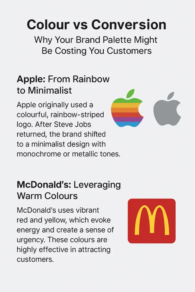
Apple: From Rainbow to Minimalist
Apple’s brand journey is one of the most powerful examples of how colour theory shapes perception. In its early days, Apple used a rainbow-striped logo that conveyed creativity, playfulness, and accessibility. It reflected the company’s mission of making computers friendly and approachable at a time when technology felt intimidating.
However, when Steve Jobs returned in the late 1990s, Apple needed to reposition itself as a premium, design-driven brand. The rainbow colours were replaced with sleek monochrome and metallic tones. This minimalist palette created a sense of sophistication, innovation, and luxury. The shift directly influenced customer perception; Apple was no longer just a computer brand, but a lifestyle choice.
Lesson: Colours can elevate a brand from functional to aspirational. Apple’s strategic use of muted, minimalist tones built an identity of trust, elegance, and cutting-edge innovation, helping the brand boost conversions by aligning with high-end consumer expectations.
McDonald’s: Leveraging Warm Colours
McDonald’s is a masterclass in how colour can drive instant action. The brand relies heavily on red and yellow, two of the most stimulating colours in psychology. Red evokes excitement and urgency, often increasing appetite, while yellow conveys happiness and friendliness. Together, they create a powerful combination that draws attention and stimulates quick decision-making.
These warm colours also have practical advantages: they stand out from a distance, making McDonald’s outlets instantly recognisable across the globe. More importantly, they encourage a sense of energy and speed, perfectly aligning with the brand’s promise of fast service.
Lesson: By consistently using red and yellow, McDonald’s has hardwired its identity into consumer minds. The palette not only makes the brand iconic but also actively influences buying behaviour by sparking hunger and urgency, driving conversions every day.
How Colours Influence Buying Decisions?
Psychologists suggest that up to 90% of snap judgments about products are based on colour alone. Red can create urgency, often used in “sale” signs, while green reassures customers about eco-friendliness or financial growth. Even cultural contexts matter, for example, white symbolises purity in many countries but may signify mourning in others. Understanding this influence ensures your colours guide customers towards “yes” instead of creating silent resistance.
Common Mistakes Brands Make With Colour Choices
Many businesses fall into traps when selecting their palette:
- Choosing colours based only on personal preference rather than audience psychology
- Using too many shades, which dilutes brand recall
- Ignoring accessibility, like poor contrast that makes text unreadable
- Forgetting cultural nuances that may shift colour meanings across regions
These mistakes can slowly erode trust and hurt conversions without brands realising why.
Case Studies: When Colour Boosted or Hurt Conversions
A famous fast-food chain once tested green packaging to highlight health-conscious options. While it aligned with the product message, it confused loyal customers who associated the brand with its iconic red and yellow. On the other hand, an e-commerce store increased conversions simply by changing its “Buy Now” button from grey to orange, making it stand out and convey energy. Small colour shifts can have big results.
Balancing Aesthetics and Conversion Goals
A beautiful palette is important, but not at the cost of effectiveness. The key is balance: use colours that reflect your identity but also nudge customers towards desired actions. Your website, ads, and packaging should look consistent yet strategically designed to draw attention where it matters, such as headlines, call-to-action buttons, or offers.
How to Choose the Right Palette for Your Brand Identity?
Here’s how to apply colour psychology in branding while picking your palette:
- Your target audience: What emotions do you want to trigger?
- Your industry standards: Do you blend in or stand out intentionally?
- Your brand values: What should customers feel about you?
- Testing results: Are people engaging or dropping off because of colour choices?
This process ensures your brand looks authentic while supporting conversions.
Testing and Measuring Colour Impact on Conversion Rates
Colour decisions should not rely on guesswork. A/B testing different button colours, banner shades, or background contrasts can reveal what resonates most with customers. Heatmaps and analytics tools also show where attention lingers, a sign your colour cues are working. By measuring impact, you refine your palette into a tool for growth, not just decoration.
Conclusion: Turning Colours Into a Conversion Asset
Your brand palette is more than an aesthetic choice. It is a strategic tool that shapes perception, influences buying decisions, and drives conversions. When used wisely, colours become an asset that transforms your brand identity into an emotional experience for customers.
Understanding colour psychology in branding ensures you avoid costly mistakes and instead build a palette that resonates, engages, and converts. The next time you choose a shade for your logo, packaging, or website, remember, it might just decide whether your customer clicks “buy” or walks away.