- July 31, 2025
- Posted by: Admin
- Category: Blogs
Introduction
Your landing page is often the first and only chance to capture a potential customer’s interest. While you might be investing in ads, SEO, or content marketing, if your landing page doesn’t convert, you’re simply burning your budget.
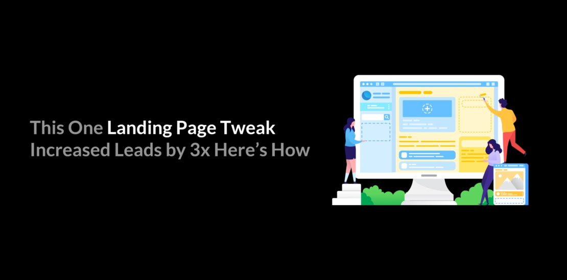
Here we uncover how a single, strategic landing page optimisation tweak resulted in a 3x increase in website leads for a client. Whether you’re a marketer, business owner, or web designer, this simple change could help boost your lead conversion rate without a complete overhaul.
Let’s dive into what changed, why it worked, and how you can apply the same principle to build high-converting landing pages for your own campaigns.
What Your Landing Page Does for You?: The Real Impact
A landing page is not just another webpage. It’s a conversion engine.
When a user clicks on your ad, sees your campaign, or lands from a search result, your landing page is the very first handshake. It’s your digital first impression, and like in real life, you don’t get a second chance to make one.
Your landing page carries the weight of multiple critical roles at once:
- It captures attention instantly.
In just a few seconds, the visitor decides whether to stay or bounce. A confusing layout, slow loading time, or unclear message can cost you the click and the customer. - It communicates value clearly.
Your product or service might be great, but if your landing page doesn’t say it the right way, it won’t matter. The landing page turns your offerings into a story your audience relates to, with clear headlines, relatable benefits, and strong proof points. - It builds trust.
Through testimonials, recognisable brand elements, or simple, clean design, your landing page either builds credibility or breaks it. For a visitor who doesn’t know your brand yet, the layout, visuals, and tone all contribute to trustworthiness.
Explore: How can you build a brand from scratch?. - It guides action.
Whether it’s a purchase, sign-up, call, or download, your landing page gives the visitor a reason to act now. Smart CTA placement, urgency, and relevance are what turn curiosity into commitment. - It amplifies your ad ROI.
Running ads without an optimised landing page is like inviting guests to an empty room. You spend money to bring people in, but if the page doesn’t convert, you lose both traffic and budget. - It creates consistency.
The best-performing landing pages carry forward the same message, look, and promise your ad or post gave. This consistency reduces bounce rates and increases trust, which ultimately boosts your conversion rate.
The Problem: What Wasn’t Working?
Despite driving a good amount of traffic through paid ads and organic efforts, the landing page in question was failing to convert. On paper, everything looked fine: a clean design, a clear CTA, and a decent offer. So, what went wrong?
Here’s what we identified:
- No Clear Value Proposition
Visitors couldn’t immediately understand what was being offered or how it benefited them. The messaging was generic, lacking emotional appeal or urgency. - Above-the-Fold Confusion
The most critical part of the page, what users see first, had too much text and no visual focus. There was no clear action path. - CTA That Didn’t Speak to the User
The call-to-action (CTA) button said “Submit”, a word that’s passive and vague. It didn’t communicate any real incentive or outcome. - No Social Proof
In a world driven by trust, the absence of testimonials, client logos, or user reviews made the page feel less credible. - Slow Load Time
The page took nearly 5 seconds to load on mobile, enough to lose nearly half the visitors before they even saw the offer.
The core issue? The page wasn’t optimised for conversions. It was functional, but not persuasive. Visitors were landing, not staying, and definitely not converting.
The Tweak: What We Changed and Why It Worked?
We didn’t rebuild the entire landing page. Instead, we made one strategic tweak: we completely overhauled the above-the-fold section. This is the first thing a visitor sees without scrolling, and we made it count.
Here’s what we did differently:
- Crafted a Strong Headline
We replaced the generic headline with a value-driven statement that clearly addressed the user’s need and hinted at the solution.
Old: “Welcome to Our Page”
New: “Double Your Leads Without Doubling Your Ad Spend” - Added a Clear Subheading
A short supporting line clarified the benefit and made it relatable. - Optimised the CTA
“Submit” was swapped out for something action-oriented and outcome-focused:
“Get My Free Strategy Plan” - Included Social Proof
We added a simple testimonial and trust badges to build credibility instantly. - Improved Visual Hierarchy
A bold, clean design with a relevant image helped guide the eyes naturally from headline → subheadline → CTA. - Reduced Load Time
Compressed the hero image and removed unused scripts to make the page load under 2 seconds.
Before vs After: Real Data & Impact
Let’s break it down with real numbers, because results speak louder than words.
| Metric | Before the Tweak | After the Tweak | Improvement |
| Landing Page Conversion Rate | 1.20% | 3.80% | 3x higher |
| Average Time on Page | 21 seconds | 1 minute 05 seconds | More than doubled |
| Bounce Rate | 74% | 46% | Significantly reduced |
| Lead Cost (via Ads) | ₹312 per lead | ₹104 per lead | 68% cost reduction |
| Leads per Week | 30–35 | 90–100 | 3x growth |
Why These Changes Mattered?
- Clear headline = faster connection with the audience
- Better CTA = more clicks
- Proof = more trust
- Less clutter = more action
We didn’t need a bigger budget. We just needed a smarter design.
Key takeaway: You don’t always have to redesign your entire website to see results. Small, intentional tweaks can drive big returns.
Why This Tweak Works?(The Psychology Behind It)
When it comes to landing page optimisation, it’s not always about big overhauls. Sometimes, small strategic changes make the biggest difference, because they tap into how users think.
The tweak we applied worked because it reduced decision fatigue. When visitors land on a cluttered or confusing page, they often exit without taking action. By simplifying the layout and making the call-to-action (CTA) more direct, we made it easier for users to know what to do next.
It’s about building trust in seconds. Clean design, a clear message, and one focused action reduce mental effort. Visitors don’t want to think; they want to be guided. That’s exactly what this simple tweak achieved, making the landing page work with human behaviour, not against it.
Final Thoughts: Simple Fixes, Big Wins
Sometimes, all it takes is one small tweak to turn a good landing page into a great one. In our case, a simple adjustment led to 3x more leads, without spending extra on ads or redesigning the entire site.
That’s the power of smart landing page optimisation.
The best part? You don’t need to be a tech expert or a designer to get results. Just focus on user experience, clarity, and one clear goal per page. Track what works, experiment with small changes, and watch your conversions grow.
So before you think about running more paid ads, ask yourself:
Is your landing page truly ready to convert?