- April 26, 2025
- Posted by: Admin
- Category: Blogs
Ever found yourself endlessly scrolling through Netflix, only to stop at one show just because the thumbnail felt right?
Well, you’re not alone.
Netflix doesn’t just throw a random image up there. Behind every click-worthy thumbnail lies a deep understanding of human psychology, visual storytelling, and good old-fashioned A/B testing. In fact, Netflix tests multiple thumbnails for every show, analysing which one gets the most clicks and often, the difference in performance can be as high as 20-30%.
Now, imagine applying that same visual strategy to your ads.
In the age of short attention spans and endless content, your ad visual is the first and sometimes the only shot you have at grabbing attention. And that’s where Netflix thumbnails can be a masterclass in creating visuals that convert.
In this blog, we’re diving into what makes these thumbnails so powerful, and how marketers, designers, and advertisers can use these insights to level up their visual game.
What Makes Netflix Thumbnails So Effective?
Netflix thumbnails aren’t just pretty pictures. They’re backed by data, strategy, and serious psychology. Here’s what they get right and why we marketers should take notes:
1. Emotional Connection in a Single Frame
Netflix understands that emotion sells. Their thumbnails zoom in on facial expressions whether it’s shock, laughter, or fear. A good thumbnail feels something. Why? Because emotions are attention magnets.
Marketing Takeaway: Use ad visuals that evoke a strong emotional response. Whether it’s curiosity, excitement, or even FOMO, an expressive face often performs better than a crowded, over-designed visual.
2. Minimalism With a Clear Focal Point
No clutter. No text overload. Netflix keeps thumbnails clean with one subject or scene taking centre stage. The simplicity guides the viewer’s eye exactly where it should go.
Marketing Takeaway: Keep your ad creative clean. Make sure the viewer knows exactly what you want them to look at in the first second. Visual hierarchy matters.
3. Colour Psychology in Play
Netflix uses vibrant colours and high contrast to help thumbnails stand out even on a mobile screen. Think red jackets against grey backgrounds or neon lighting that catches the eye.
Marketing Takeaway: Use bold, high-contrast colours strategically in your ads. Understand colour psychology to nudge your audience’s emotions and responses.
4. Constant Testing and Optimisation
Did you know that Netflix shows different thumbnails to different people based on viewing habits? Someone who loves rom-coms might see a soft, romantic shot, while a thriller lover might get a darker, intense visual for the same show.
Marketing Takeaway: A/B testing is not optional. Try different ad versions for different audience segments. Your best-performing visual might surprise you.
A/B Testing – Netflix Style
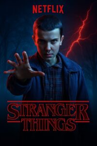
Take Stranger Things, for example. The series has everything from ‘80s nostalgia and sci-fi horror to emotional friendships and supernatural chaos. A single thumbnail can’t capture it all.
So, Netflix doesn’t settle for one. Instead, it showcases different characters and moods across personalised Netflix Thumbnails, tailored to match what you emotionally connect with. If you’ve been watching sci-fi thrillers, your thumbnail might highlight Eleven using her powers. Prefer drama and friendship stories? You might see the gang riding bikes through the woods. It’s a clever way of covering a breadth of themes in the show without relying on just one visual narrative.
This shows how thumbnails aren’t just about aesthetics, they’re about strategy. They’re visual teasers, custom-built to reflect the part of the story that you are most likely to click on.

Source: netflixtechblog.com
Imagine it’s a quiet night. You’re scrolling through Netflix, hunting for something new but familiar. A flash of light, a synth-wave beat, and there it is: a thumbnail of Eleven, her hand outstretched, nose bleeding, with that intense, otherworldly stare.
You’re hooked!
But here’s the twist you might see a completely different side of Stranger Things. Your friend, who’s more into heartfelt moments than monster hunts, gets a thumbnail with Mike and Eleven holding hands under fairy lights. Another user, deep into horror and suspense, sees the Demogorgon emerging from the shadows, mouth wide open, in full creature-feature glory.
What’s happening here? Netflix isn’t just showing random scenes—they’re creating mini portals into the Upside Down, carefully crafted based on your viewing behaviour. It’s storytelling before the story even starts. These Netflix Thumbnails aren’t just still images; they’re psychological hooks.
Each thumbnail becomes a chapter preview from an alternate dimension of the show one that resonates with you. And much like Hawkins, Indiana, where not everything is as it seems, Netflix’s thumbnails are quietly doing the work in the background, drawing you into your version of the story.
That’s the power of personalised visual storytelling subtle, smart, and just a little bit strange.
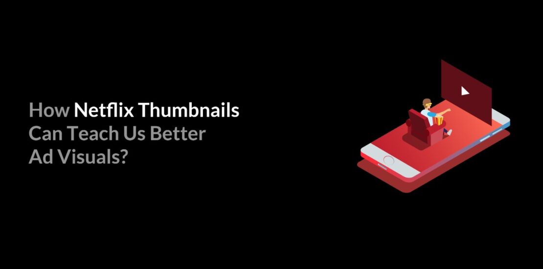
Netflix Thumbnails Can Teach Us Better Ad Visuals
Netflix thumbnails aren’t just random stills from a show they’re strategic, psychology-backed visuals designed to grab attention in milliseconds. These tiny posters use data-driven design, emotion-triggering imagery, and personalisation to appeal directly to user preferences. By testing different thumbnails for different audiences, Netflix has mastered the art of visual storytelling even before a show begins.
- For marketers, the lesson is clear:
Know your audience
Design for emotion
Test and adapt
Whether you’re creating a display ad, a product banner, or a social media post the thumbnail mindset teaches us that a single image can make or break user engagement. It’s time we move beyond generic creatives and embrace custom, story-driven visuals just like Netflix does.
Final Thoughts:
In a world overflowing with content, attention is currency and Netflix thumbnails are proof that visual storytelling isn’t just an art, it’s a science. From evoking emotion in a single frame to crafting visuals based on who’s watching, Netflix has cracked the code of capturing interest before the play button is even hit.
As marketers, we’re no longer just selling a product, we’re selling a moment, a feeling, a click. It’s time to stop treating creatives as mere fillers and start treating them as hooks.
At White Elephant Tech, we believe great visuals aren’t optional, they’re essential. The next time you design an ad visual, ask yourself
“Would I stop scrolling for this?”
If a thumbnail can make someone binge-watch 8 hours of a show, imagine what your visuals can do when they’re crafted with the same thought. Let’s learn from the masters and create scroll-stopping, story-pulling, emotionally-charged visuals that actually damati.